In this post we will create simple and powerful Text Slider Component in Lightning.
Below are list of all features supported by this Component
- Its pure CSS based without any JavaScript libraries therefore super fast
- Long contents are auto scrolled with nice overloaded CSS for scroll bars
- Ability to set Header and Body Text for each slides
- Enable or disable auto background colors
- Enable or disable auto slideshow
- Control slides delays in case timer enabled
- If auto background color turned off then ability to control background and text color
- Slider contents are un-escaped means we can render richtext content
Before diving into the source code, see below Live Demo. (Lightning component is rendered on Visualforce with the help of Lightning Out to show this demo)
Lets start with first component. This component is only used to define attributes for each slide. This component would be used by parent component as a part of facets to read all slider properties.
Slide.cmp
<aura:component >
    <aura:attribute name="title" type="String" required="true"/>
    <aura:attribute name="content" type="String" required="true"/>
    <aura:attribute name="bgColor" type="String" default="#0070d2" />
    <aura:attribute name="contentColor" type="String" default="#fff" />
    <aura:attribute name="isFocused" type="Boolean" default="false" />
</aura:component>
Next comes, brain of this application. All heavy lifting for css is done here. You can refer this component to see how Nested components can be used and how we can read nested component properties in parent component.
AnimatedSlider.cmp
<aura:component >
    <aura:attribute type="Aura.Component[]" name="slideContents" />
    <aura:Attribute type="String" name="height" default="300px" />
    <aura:attribute type="Object[]" name="slidersList" />
    <aura:attribute name="isAutoTimer" type="Boolean" default="false" />
    <aura:attribute name="delay" type="Integer" default="3" description="Delay for slider change in seconds."/>
    <aura:attribute name="autoBgColor" type="String" default="false" description="Let application decide if background color should be automatically changed. If this flag is ON then bgColor in slide will not work."/>
    <aura:handler name="init" value="{!this}" action="{!c.doInit}"/>

<div class="slds" style="{# 'height:'+v.height+';width:100%'}">

<div class="css-slider-wrapper">

            <aura:iteration items="{!v.slidersList}" var="s" indexVar="i">
                 <input data-selected-Index="{!i}" type="radio" name="slider" class="{# 'slide-radio'+(i+1)}" checked="{!s.isFocused}" id="{# 'slider_'+(i+1)}" />
            </aura:iteration>

<div class="slider-pagination">
                <aura:iteration items="{!v.slidersList}" var="s" indexVar="i">
                    <label data-selected-Index="{!i}" for="{# 'slider_'+(i+1)}" class="{# 'page'+(i+1)}" onclick="{!c.changePageNumber}"></label>
                </aura:iteration>
            </div>

            <aura:iteration items="{!v.slidersList}" var="s" indexVar="i">

<div class="{# 'slider slide'+(i+1)}" style="{# 'background :'+s.bgColor+';left:'+(i*100)+'%'}">

<div class="scroll scrollbarStyle">

<h2 style="{# 'color:'+s.contentColor}"> {# s.title} </h2>

                        <span class="bodyContent" style="{# 'color:'+s.contentColor}">
                            <aura:unescapedHtml value="{# s.content}" />
                        </span>
                    </div>

                </div>

            </aura:iteration>
        </div>

    </div>

</aura:component>
AnimatedSliderController.js
({
	doInit : function(component, event, helper) {
		helper.doInit(component, event, helper);
	},
    changePageNumber : function(component, event, helper){
        helper.changePageNumber(component, event, helper);
    }
})
AnimatedSliderHelper.js
({
	doInit : function(component, event, helper)  {
        this.createSlideJSON(component.get("v.body"), component);
        var isAutoTimer = component.get("v.isAutoTimer");

        if(isAutoTimer){
            var delay = component.get("v.delay");
            window.setInterval(function(){
                helper.nextSlideTimer(component);
            },delay*1000);
        }
	},
    createSlideJSON : function(slidefacet, component){
        var autoColor = component.get("v.autoBgColor");
        var autoColorCounter = 0;
        var bgColors = ["#00bcd7","#009788","#0070d2","#faac58","#304a62","#660099"];
        var titleColors = ["#000","#fff","#fff","#000","#fff","#fff"];
    	var slides = [];
        var currentBGColor,currentColor;

        for (var i = 0; i < slidefacet.length; i++) { var isFocused = slidefacet[i].get("v.isFocused") ; if(i === 0){ isFocused=true; } currentBGColor = slidefacet[i].get("v.bgColor") ; currentColor = slidefacet[i].get("v.titleColor"); if(autoColor){ currentBGColor = bgColors[autoColorCounter]; currentColor = titleColors[autoColorCounter]; autoColorCounter++; if(autoColorCounter >= bgColors.length){
                    autoColorCounter = 0;
                }
            }
            var singleSlide = {
                title : slidefacet[i].get("v.title") ,
                content : slidefacet[i].get("v.content"),
                bgColor : currentBGColor,
                contentColor: currentColor,
                isFocused: isFocused
            };
    		slides.push(singleSlide);
        }
        component.set("v.slidersList",slides);
    } ,
    nextSlideTimer : function(component){
        var slideInfo = component.get("v.slidersList");
        if(slideInfo){
            for (var i = 0; i < slideInfo.length; i++) { //its last slide and focused, so move to first again
if(slideInfo[i].isFocused && i >= slideInfo.length-1){
                    slideInfo[i].isFocused = false;
                    slideInfo[0].isFocused = true;
                    break;
                }else if(slideInfo[i].isFocused){
                    slideInfo[i].isFocused = false;
                    slideInfo[i+1].isFocused = true;
                    break;
                }
            }
        }
        component.set("v.slidersList",slideInfo);
    },
    changePageNumber : function(component, event, helper){
        var target = event.target;
        var selecIndex = target.getAttribute("data-selected-Index");
		var slideInfo = component.get("v.slidersList");
        if(slideInfo){
			for (var i = 0; i < slideInfo.length; i++) {
                slideInfo[i].isFocused = false;
            }
            slideInfo[selecIndex].isFocused = true;
        }
        component.set("v.slidersList",slideInfo);
    }
})
AnimatedSlider.css
.THIS .css-slider-wrapper {
       display: block;
      background: #FFF;
      overflow: hidden;
      position: relative;
     height:100%;
     width:100%;
}
.THIS  .slider {
      width: 100%;
      height: 100%;
      background: red;
      position: absolute;
      opacity: 1;
      z-index: 0;
      display: flex;
      display: -webkit-flex;
      display: -ms-flexbox;
      flex-direction: row;
      flex-wrap: wrap;
      -webkit-flex-align: center;
      -webkit-align-items: center;
      align-items: center;
      justify-content: center;
      align-content: center;
      -webkit-transition: -webkit-transform 1600ms;
      transition: -webkit-transform 1600ms, transform 1600ms;
      -webkit-transform: scale(1);
      transform: scale(1);
      }

 .THIS .slider > div {
    text-align: center;
  }
.THIS .css-slider-wrapper input[type="radio"]{
    display:none;
}
.THIS .slider .bodyContent{
      font-size: 1rem;
}
 .THIS .slider h2 {
      font-weight: 500;
      font-size: 3rem;
      line-height: 120%;
  }
  .THIS .slider-pagination {
      position: absolute;
      bottom: 20px;
      width: 100%;
      left: 0;
      text-align: center;
      z-index: 1000;
  }
   .THIS .slider-pagination label {
      width: 10px;
      height: 10px;
      border-radius: 50%;
      display: inline-block;
      background: rgba(255,255,255,0.2);
      margin: 0 2px;
      border: solid 1px rgba(255,255,255,0.4);
      cursor: pointer;
      }

  /* display respective checkboxes selected on slide change */
  .THIS .slide-radio1:checked ~ .slider-pagination .page1,
  .THIS .slide-radio2:checked ~ .slider-pagination .page2,
  .THIS .slide-radio3:checked ~ .slider-pagination .page3,
  .THIS .slide-radio4:checked ~ .slider-pagination .page4,
  .THIS .slide-radio5:checked ~ .slider-pagination .page5,
  .THIS .slide-radio6:checked ~ .slider-pagination .page6,
  .THIS .slide-radio7:checked ~ .slider-pagination .page7,
  .THIS .slide-radio8:checked ~ .slider-pagination .page8,
  .THIS .slide-radio9:checked ~ .slider-pagination .page9,
  .THIS .slide-radio10:checked ~ .slider-pagination .page10 {
      background: rgba(255,255,255,1)
  }
  /* Only 10 slides supported */
 .THIS  .slide-radio1:checked ~ .slider {
      -webkit-transform: translateX(0%);
      transform: translateX(0%);
  }
 .THIS  .slide-radio2:checked ~ .slider {
      -webkit-transform: translateX(-100%);
      transform: translateX(-100%);
  }
 .THIS  .slide-radio3:checked ~ .slider {
      -webkit-transform: translateX(-200%);
      transform: translateX(-200%);
  }
 .THIS  .slide-radio4:checked ~ .slider {
      -webkit-transform: translateX(-300%);
      transform: translateX(-300%);
  }
.THIS  .slide-radio5:checked ~ .slider {
      -webkit-transform: translateX(-400%);
      transform: translateX(-400%);
  }
.THIS  .slide-radio6:checked ~ .slider {
      -webkit-transform: translateX(-500%);
      transform: translateX(-500%);
  }
.THIS  .slide-radio7:checked ~ .slider {
      -webkit-transform: translateX(-600%);
      transform: translateX(-600%);
  }
.THIS  .slide-radio8:checked ~ .slider {
      -webkit-transform: translateX(-700%);
      transform: translateX(-700%);
  }
.THIS  .slide-radio9:checked ~ .slider {
      -webkit-transform: translateX(-800%);
      transform: translateX(-800%);
  }
.THIS  .slide-radio10:checked ~ .slider {
      -webkit-transform: translateX(-900%);
      transform: translateX(-900%);
  }
.THIS .scroll{
    overflow-y: auto;
    height: 75%;
}

.THIS .scrollbarStyle::-webkit-scrollbar-track
{
	-webkit-box-shadow: inset 0 0 6px rgba(216, 237, 255, 1);
	border-radius: 10px;
	background-color: #F5F5F5;
}

.THIS .scrollbarStyle::-webkit-scrollbar
{
	width: 6px;
	background-color: #F5F5F5;
}

.THIS .scrollbarStyle::-webkit-scrollbar-thumb
{
	border-radius: 10px;
	-webkit-box-shadow: inset 0 0 6px rgba(216, 237, 255, 1);
	background-color: #999;
}

/*Smaller Screens*/
@media only screen and (max-width: 767px) {
  .THIS .slider h2 {
      font-size: 1.5em;
  }
  .THIS .slider > div {
      padding: 0 2%
  }
   .THIS .slider .bodyContent{
      font-size: 0.8rem;
   }
  }
Lets put all together to see Demo and how it looks.
SliderDemo.cmp
<aura:component implements="flexipage:availableForAllPageTypes" access="global">
<c:AnimatedSlider height="200px" isAutoTimer="true" autoBgColor="true" delay="5">
<c:Slide title="Slider Component for Lightning" content="Simple Slider component with Navigation" bgColor="#00bcd7"/>
<c:Slide title="Custom Scroll bars for Long Text" content="Its long long long text but still won't look bad. It contains custom CSS for scrollbars however, will only work in modern browsers. Its long long long text but still won't look bad. It contains custom CSS for scrollbars however, will only work in modern browsers. Its long long long text but still won't look bad. It contains custom CSS for scrollbars however, will only work in modern browsers. Its long long long text but still won't look bad. It contains custom CSS for scrollbars however, will only work in modern browsers. Its long long long text but still won't look bad. It contains custom CSS for scrollbars however, will only work in modern browsers. Its long long long text but still won't look bad. It contains custom CSS for scrollbars however, will only work in modern browsers. Its long long long text but still won't look bad. It contains custom CSS for scrollbars however, will only work in modern browsers. Its long long long text but still won't look bad. It contains custom CSS for scrollbars however, will only work in modern browsers. Its long long long text but still won't look bad. It contains custom CSS for scrollbars however, will only work in modern browsers. Its long long long text but still won't look bad. It contains custom CSS for scrollbars however, will only work in modern browsers. Its long long long text but still won't look bad. It contains custom CSS for scrollbars however, will only work in modern browsers. Its long long long text but still won't look bad. It contains custom CSS for scrollbars however, will only work in modern browsers. Its long long long text but still won't look bad. It contains custom CSS for scrollbars however, will only work in modern browsers. Its long long long text but still won't look bad. It contains custom CSS for scrollbars however, will only work in modern browsers. Its long long long text but still won't look bad. It contains custom CSS for scrollbars however, will only work in modern browsers." />
<c:Slide title="Nested Component" content="Good example of using Nested Components in Lightning" />
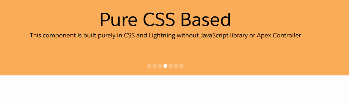
<c:Slide title="Pure CSS Based" content="This component is built purely in CSS and Lightning without JavaScript library or Apex Controller" bgColor="#009788" />
<c:Slide title="Timer" content="Time for auto slideshow. Delay can be configured and Timer can be turned OFF or ON" />
<c:Slide title="Known Limitation" content="Currently it supports 10 slides. To increase capacity, simply change CSS." />
<c:Slide title="Richtext Support" content="Contents from Rich text fields are supported." />
</c:AnimatedSlider>
</aura:component>
And that’s all. Your Text slider component in Lightning is ready for use. Read here to know how I displayed Lightning component to unauthenticated users for demo purpose.
Leave a Reply