
Just after two days of writing Circular Progress Bar , came up with few more requirements. So, In this post, will share updated code of Circular Progress Bar. This component can be easily used from Lightning App Builder, check this video to get an idea on how it can be used and configured.
Complete source code of this component is available on my git repository. Make sure to follow me to get updated by other free source codes. 🙂
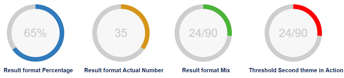
In additional to all previous capabilities, below features are added:
- Conditional Theme – Let’s say before 50% progress bar should be displayed as red and after 50% green.
- Threshold – On basis of this value, theme will change
- Added one more theme – red
- We can show value inside component in three format now – percentage, Actual value or Mix
- Legend font size changes according to size of component
Apex class – CircularProgressController
/**
 * Author	:	Jitendra Zaa
 * Desc		:	Controller class for LEX component CircularProgress.
 * 			:	On the basis of field API name passed, it calculates percentage of completion.
 * */
public class CircularProgressController {

    /**
     * This class is used to return as JSON Object
     **/
    class WrapperJSON{
        public Integer total {get;set;}
        public Integer actual {get;set;}
        public Integer val {get;set;}
    }

    @AuraEnabled
    public static String computePercentage(String sObjectName, String recordId, String totalValueFieldName, String actualValueFieldName){
        Integer retVal = 0 ;
        String query = null;
        WrapperJSON retObj = new WrapperJSON();

        if(totalValueFieldName != null && totalValueFieldName.trim() != '' &&  actualValueFieldName != null && actualValueFieldName.trim() != '' ){
            query = 'SELECT '+totalValueFieldName+', '+actualValueFieldName+' FROM '+sObjectName+' WHERE Id =: recordId';
        }
        else if (actualValueFieldName != null && actualValueFieldName.trim() != '' ) {
            query = 'SELECT '+actualValueFieldName+' FROM '+sObjectName+' WHERE Id =: recordId';
        }

        if(query != null){
            try{
                List<SOBject> lstObj = Database.query(query);
                if(lstObj.size() > 0){
                    Decimal totalVal = 0;
                    Decimal actualVal = 0;

                    if(totalValueFieldName != null && totalValueFieldName.trim() != ''){
                        totalVal = Decimal.valueOf(String.valueOf(lstObj[0].get(totalValueFieldName)));
                        retObj.total = Integer.valueOf(totalVal) ;
                    }
                    actualVal = Decimal.valueOf(String.valueOf(lstObj[0].get(actualValueFieldName)));
                    //Means only 1 API Name was supplied and field type is percentage
                    if(totalVal == 0){
                        retObj.val = Integer.valueOf(actualVal) ;
                        retObj.actual = Integer.valueOf(actualVal) ;
                    }else if (actualVal > 0){
                        retObj.val = Integer.valueOf( ( actualVal / totalVal ) * 100 );
                        retObj.actual = Integer.valueOf(actualVal) ;
                    }
                }
            }catch(Exception e){}

        }
        return JSON.serialize(retObj) ;
    }
}
Test class – CircularProgressControllerTest (96%)
/**
* Author : Jitendra Zaa
* Desc : Test class for Apex - CircularProgressController
* */
@isTest
public class CircularProgressControllerTest {

@testSetup static void methodName() {
Opportunity opp = new Opportunity(Name='Circular Progress bar Test',Amount=80,Probability=60,stageName='In Progress',CloseDate=Date.today().addMonths(2));
insert opp;
}

/**
* Below test method creates dynamic SOQL on the basis of two field API provided
* */
@isTest
static void testUsingFields(){
Opportunity opp = [SELECT Id, Amount, ExpectedRevenue FROM Opportunity];
String retVal = CircularProgressController.computePercentage('Opportunity',Opp.id,'Amount','ExpectedRevenue');

CircularProgressController.WrapperJSON retPOJO = (CircularProgressController.WrapperJSON)JSON.deserialize(retVal, CircularProgressController.WrapperJSON.class);
System.assertEquals(retPOJO.actual, 48) ;
System.assertEquals(retPOJO.total, 80) ;
System.assertEquals(retPOJO.val, 60) ;
}

/**
* Below test method creates dynamic SOQL on the basis of single field considering it as
* percentage type of field
* */
@isTest
static void testUsingSingleField(){
Opportunity opp = [SELECT Id, Amount, ExpectedRevenue FROM Opportunity];
String retVal = CircularProgressController.computePercentage('Opportunity',Opp.id,'','Amount');

CircularProgressController.WrapperJSON retPOJO = (CircularProgressController.WrapperJSON)JSON.deserialize(retVal, CircularProgressController.WrapperJSON.class);
System.assertEquals(retPOJO.actual, 80) ;
System.assertEquals(retPOJO.total, null) ;
System.assertEquals(retPOJO.val, 80) ;
}

}
CircularProgress.cmp
<aura:component implements="flexipage:availableForAllPageTypes, flexipage:availableForRecordHome, force:hasRecordId, force:hasSObjectName" access="global" controller="CircularProgressController">

    <aura:attribute name="recordId" type="Id" description="Id of record on which this component is hosted." />
    <aura:attribute name="sObjectName" type="String" description="API name of record on which this component is hosted." />
    <aura:attribute name="resultFormat" type="String" default="Percentage" description="Format of result to be displayed inside Circular Progress Bar. Allowed values are Percentage, Actual Number, Mix." />
    <aura:attribute name="Legend" type="String" description="Legend to display" />

	<aura:attribute name="perText" type="String" default="0%" description="Text to display inside circle. It is auto calculated field and used internally." />
    <aura:attribute name="cirDeg" type="String" default="0" description="Degree of Progress to show. It is auto calculated field and used internally." />

    <aura:attribute name="totalProgress" type="String" default="100" description="Total progress. It can be number OR API name of field." />
    <aura:attribute name="actualProgress" type="String" default="50" description="Actual progress. It can be number OR API name of field." />

    <aura:attribute name="themeBeforeThreshold" type="String" default="green" description="Theme of Circular Progress Bar. Possible values are blue, green, orange." />
    <aura:attribute name="themeAfterThreshold" type="String" default="red" description="Theme of Circular Progress Bar. Possible values are blue, green, orange." />
    <aura:attribute name="theme" type="String" default="green" description="Internally used attribute to decide final theme on basis of threshold value"/>

    <aura:attribute name="size" type="String" default="small" description="Size of Circular Progress Bar. Possible values are small, medium, big." />
    <aura:attribute name="threshold" type="String" default="50" description="This field can be used to support multiple theme after threshold value" />
    <aura:handler name="init" value="{!this}" action="{!c.doInit}"/>


<div class="clearFloats slds-align--absolute-center">

<div class="{! ( v.cirDeg >
 179 ) ? 'container p50plus '+v.theme+' '+v.size : 'container '+v.theme +' '+v.size }">
            <span>
                <aura:if isTrue="{! v.resultFormat == 'Percentage' }">
                    {!v.perText}
                </aura:if>
                <aura:if isTrue="{! v.resultFormat == 'Actual Number' }">
                    {!v.actualProgress}
                </aura:if>
                <aura:if isTrue="{! v.resultFormat == 'Mix' }">
                    {!v.actualProgress}/{!v.totalProgress}
                </aura:if>

            </span>


<div class="slice">

<div class="bar" style="{! '-webkit-transform: rotate('+v.cirDeg+'deg); -moz-transform: rotate('+v.cirDeg+'deg); -ms-transform: rotate('+v.cirDeg+'deg); -o-transform: rotate('+v.cirDeg+'deg); transform: rotate('+v.cirDeg+'deg); -ms-transform: rotate('+v.cirDeg+'deg);'}"></div>


<div class="fill"></div>
            </div>
        </div>
    </div>
<div class="{!v.size + ' clearFloats slds-align--absolute-center legend '}">
        {!v.Legend}
    </div>


</aura:component>
CircularProgressController.js
({
	doInit : function(component, event, helper) {
		helper.doInit(component, event, helper) ;
	}
})
CircularProgressHelper.js
({
	doInit : function(component, event, helper)  {
        helper.computeProgress(component, event, helper);

	},
    computeProgress : function(component, event, helper)  {

        var totalVal = component.get("v.totalProgress");
        var actualVal = component.get("v.actualProgress");

        var threshold = component.get("v.threshold");
        var beforeTheme = component.get("v.themeBeforeThreshold");
        var afterTheme = component.get("v.themeAfterThreshold");

        if(totalVal && actualVal && !isNaN(parseInt(totalVal)) && isFinite(totalVal) && !isNaN(parseInt(actualVal)) && isFinite(actualVal)){
           //parameter is number
            var percVal = parseInt(actualVal) / parseInt(totalVal) ;
            var progressVal = parseInt(  percVal * 360  ) ;

            if((percVal * 100) >= threshold){
                component.set("v.theme" , afterTheme );
            }else{
                component.set("v.theme" , beforeTheme );
            }

            component.set("v.cirDeg" , progressVal );
            component.set("v.perText" , parseInt(percVal * 100)  +'%' );
        }else if(actualVal){
            helper.callApexMethod(component, event, helper, totalVal, actualVal);
        }else{
            //valuea are used directly
            if(actualVal >= threshold){
                component.set("v.theme" , afterTheme );
            }else{
                component.set("v.theme" , beforeTheme );
            }
        }
    },
    callApexMethod : function(component, event, helper, txt_totalVal, txt_actualVal)  {

        var action = component.get('c.computePercentage');
        var txt_recordId = component.get("v.recordId");
        var txt_sObjectName = component.get("v.sObjectName");

        action.setParams({
            recordId : txt_recordId,
            sObjectName : txt_sObjectName,
            totalValueFieldName : txt_totalVal,
            actualValueFieldName : txt_actualVal
        });

        action.setCallback(this, function(a) {
            if (a.getState() === 'SUCCESS') {
                var retObj =  JSON.parse(a.getReturnValue())  ;

                var threshold = component.get("v.threshold");
        		var beforeTheme = component.get("v.themeBeforeThreshold");
        		var afterTheme = component.get("v.themeAfterThreshold");

                component.set("v.totalProgress" , retObj.total );
                component.set("v.actualProgress" , retObj.actual );

                if( parseInt(retObj.val) >= threshold){
                	component.set("v.theme" , afterTheme );
                }else{
                    component.set("v.theme" , beforeTheme );
                }

                var progressVal = parseInt(  (retObj.val/100) * 360  ) ;
                component.set("v.cirDeg" , progressVal );
                component.set("v.perText" , parseInt(retObj.val)  +'%' );
            }
        });
        $A.enqueueAction(action);
    }
})
CircularProgress.design
<design:component>
    <design:attribute name="size" label="Size" datasource="small, medium, big" description="Size of the of the component" />

    <design:attribute name="totalProgress" label="Total" description="Either API Name of field Or numeric value showing total value to be used for computation" />
    <design:attribute name="actualProgress" label="Actual" description="Either API Name of field Or numeric value showing actual value to be used for computation" />

    <design:attribute name="Legend" label="Legend" description="Legend to be displayed." />

    <design:attribute name="resultFormat" label="Result Format" datasource="Percentage , Actual Number, Mix" description="Format of result to be displayed inside Circular Progress Bar. Allowed values are Percentage, Actual Number, Mix." />

    <design:attribute name="themeBeforeThreshold" label="Theme Before Threshold" datasource="blue, green , orange, red" description="Theme of the component before threshold" />

    <design:attribute name="themeAfterThreshold" label="Theme After Threshold" datasource="blue, green , orange, red" description="Theme of the component After threshold" />

    <design:attribute name="threshold" label="Threshold after which color needs to be chaged" description="This field can be used to support multiple theme after threshold value" />

</design:component>
CircularProgress.auradocs
<aura:documentation>
	<aura:description>
        <code>c:CircularProgress</code> component can be used to display progress in circular bar format.
    </aura:description>

	<aura:example name="Example1" label="Examples of Circular Progress Component" ref="c:CircularProgressExample">
	</aura:example>
</aura:documentation>
CircularProgress.css
.THIS .clearFloats:before, .THIS .clearFloats:after
{
    content: " ";
    display: table !important;
}

.THIS  .clearFloats:after {clear: both;}
.THIS .clearFloats {*zoom: 1; }

.THIS .container .slice , .THIS .container.p50plus .slice
{
	clip: rect(auto, auto, auto, auto);
}

.THIS .pie, .THIS .container .bar , .THIS .fill, .THIS .container.p50plus .fill{
	 position: absolute;
	  border: 0.08em solid #307bbb;
	  width: 0.84em;
	  height: 0.84em;
	  clip: rect(0em, 0.5em, 1em, 0em);
	  -webkit-border-radius: 50%;
	  -moz-border-radius: 50%;
	  -ms-border-radius: 50%;
	  -o-border-radius: 50%;
	  border-radius: 50%;
	  -webkit-transform: rotate(0deg);
	  -moz-transform: rotate(0deg);
	  -ms-transform: rotate(0deg);
	  -o-transform: rotate(0deg);
	  transform: rotate(0deg);
}

.THIS .pie-fill, .THIS .container.p50plus .bar:after, .THIS .container.p50plus .fill{
	 -webkit-transform: rotate(180deg);
	  -moz-transform: rotate(180deg);
	  -ms-transform: rotate(180deg);
	  -o-transform: rotate(180deg);
	  transform: rotate(180deg);
}

.THIS .container {
	  position: relative;
	  font-size: 120px;
	  width: 1em;
	  height: 1em;
	  -webkit-border-radius: 50%;
	  -moz-border-radius: 50%;
	  -ms-border-radius: 50%;
	  -o-border-radius: 50%;
	  border-radius: 50%;
	  float: left;
	  margin: 0 0.1em 0.1em 0;
	  background-color: #cccccc;
	}

.THIS .container *, .THIS .container *:before, .THIS .container *:after {
	  -webkit-box-sizing: content-box;
	  -moz-box-sizing: content-box;
	  box-sizing: content-box;
	}

.THIS .container.center {
	  float: none;
	  margin: 0 auto;
	}
.THIS .container.big {
	  font-size: 240px;
	}
.THIS .container.small {
	  font-size: 80px;
	}
.THIS .container.medium {
	  font-size: 160px;
	}

.THIS .container > span {
	  position: absolute;
	  width: 100%;
	  z-index: 1;
	  left: 0;
	  top: 0;
	  width: 5em;
	  line-height: 5em;
	  font-size: 0.2em;
	  color: #cccccc;
	  display: block;
	  text-align: center;
	  white-space: nowrap;
	  -webkit-transition-property: all;
	  -moz-transition-property: all;
	  -o-transition-property: all;
	  transition-property: all;
	  -webkit-transition-duration: 0.2s;
	  -moz-transition-duration: 0.2s;
	  -o-transition-duration: 0.2s;
	  transition-duration: 0.2s;
	  -webkit-transition-timing-function: ease-out;
	  -moz-transition-timing-function: ease-out;
	  -o-transition-timing-function: ease-out;
	  transition-timing-function: ease-out;
	}

.THIS .container:after {
	  position: absolute;
	  top: 0.08em;
	  left: 0.08em;
	  display: block;
	  content: " ";
	  -webkit-border-radius: 50%;
	  -moz-border-radius: 50%;
	  -ms-border-radius: 50%;
	  -o-border-radius: 50%;
	  border-radius: 50%;
	  background-color: whitesmoke;
	  width: 0.84em;
	  height: 0.84em;
	  -webkit-transition-property: all;
	  -moz-transition-property: all;
	  -o-transition-property: all;
	  transition-property: all;
	  -webkit-transition-duration: 0.2s;
	  -moz-transition-duration: 0.2s;
	  -o-transition-duration: 0.2s;
	  transition-duration: 0.2s;
	  -webkit-transition-timing-function: ease-in;
	  -moz-transition-timing-function: ease-in;
	  -o-transition-timing-function: ease-in;
	  transition-timing-function: ease-in;
	}

.THIS .container .slice {
	  position: absolute;
	  width: 1em;
	  height: 1em;
	  clip: rect(0em, 1em, 1em, 0.5em);
	}

.THIS .container:hover {
	  cursor: default;
	}

.THIS .container:hover > span {
	  width: 3.33em;
	  line-height: 3.33em;
	  font-size: 0.3em;
	}

.THIS .container:hover:after {
	  top: 0.04em;
	  left: 0.04em;
	  width: 0.92em;
	  height: 0.92em;
	}

.THIS .container.blue .bar, .THIS .container.blue .fill {
  border-color: #307bbb !important;
}

.THIS .container.blue:hover > span {
  color: #307bbb;
}

.THIS .container.green .bar, .THIS .container.green .fill {
  border-color: #4db53c !important;
}

.THIS .container.green:hover > span {
  color: #4db53c;
}

.THIS .container.orange .bar, .THIS .container.orange .fill {
  border-color: #dd9d22 !important;
}

.THIS .container.orange:hover > span {
  color: #dd9d22;
}
.THIS .container.red .bar, .THIS .container.red .fill {
  border-color: #ff0000 !important;
}

.THIS .container.red:hover > span {
  color: #ff0000;
}

.THIS.legend{
    color: rgb(22, 50, 92);
    font-weight: bold;
}
.THIS.legend.big{
    font-size: 1.25rem;
    color: rgb(22, 50, 92);
}
.THIS.legend.medium{
    font-size: 1.0rem;
    color: rgb(22, 50, 92);
}
.THIS.legend.small{
    font-size: 0.7rem;
    color: rgb(22, 50, 92);
}
CircularProgressExample.cmp
<aura:component >

<div class="slds-grid slds-p-top--xx-large">

<div class="slds-col">
            <c:CircularProgress themeAfterThreshold="blue" themeBeforeThreshold="red" size="medium" totalProgress="100" actualProgress="65" Legend="Result format Percentage" resultFormat="Percentage" threshold="50"/>
        </div>

<div class="slds-col">
            <c:CircularProgress themeAfterThreshold="orange" themeBeforeThreshold="red" size="medium" totalProgress="100" actualProgress="35" Legend="Result format Actual Number" resultFormat="Actual Number" threshold="25" />
        </div>

<div class="slds-col">
            <c:CircularProgress themeAfterThreshold="green" themeBeforeThreshold="red" size="medium" totalProgress="90" actualProgress="24" Legend="Result format Mix" resultFormat="Mix" threshold="10" />
        </div>

<div class="slds-col">
            <c:CircularProgress themeAfterThreshold="green" themeBeforeThreshold="red" size="medium" totalProgress="90" actualProgress="24" Legend="Threshold Second theme in Action" resultFormat="Mix" threshold="30" />
        </div>
    </div>
</aura:component>
Output :
Leave a Reply to Jitendra ZaaCancel reply